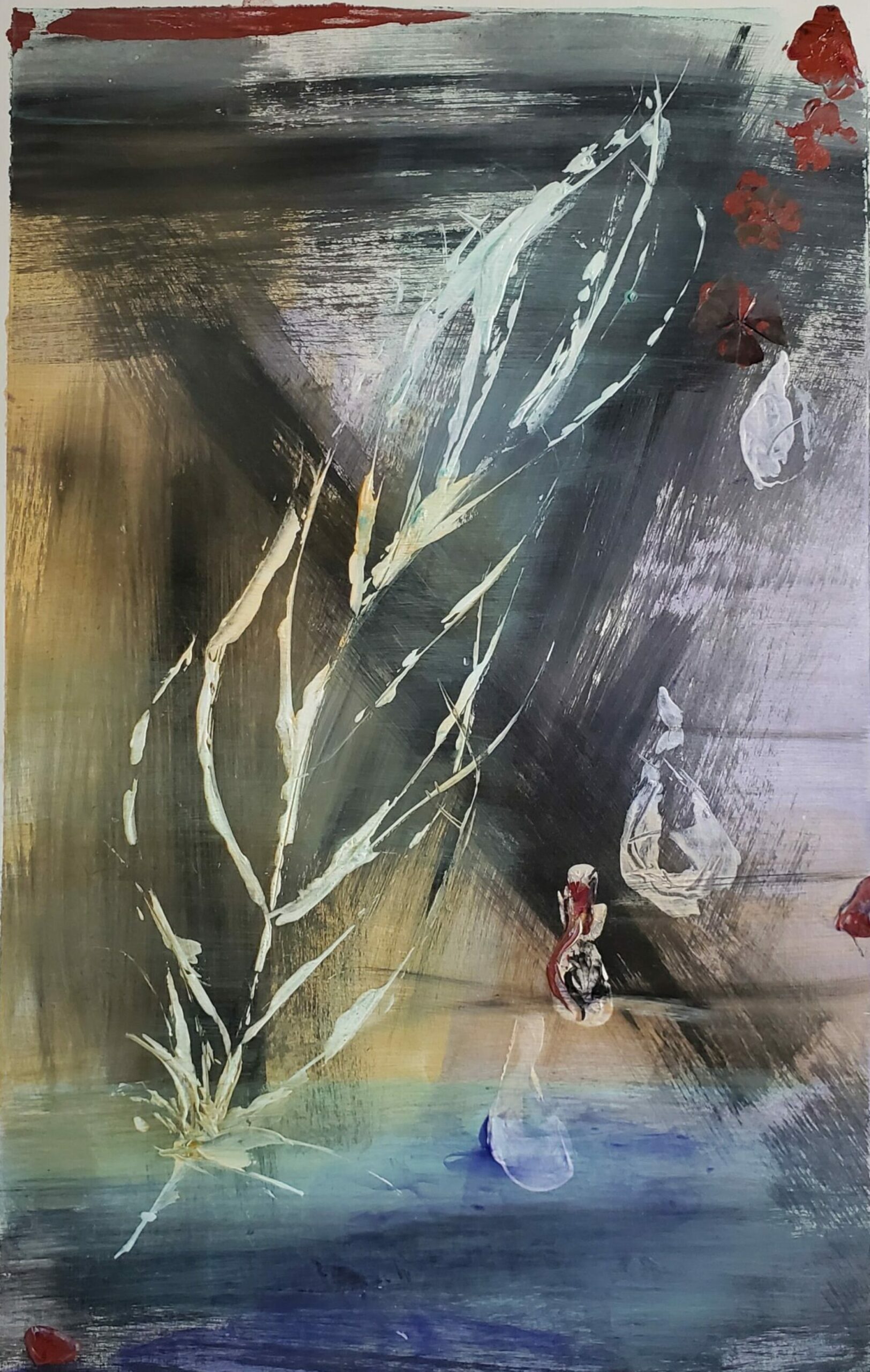
Video Final Project: Video Sequence and added Sound
‘Save the Pure’ – 0:02:25
Title 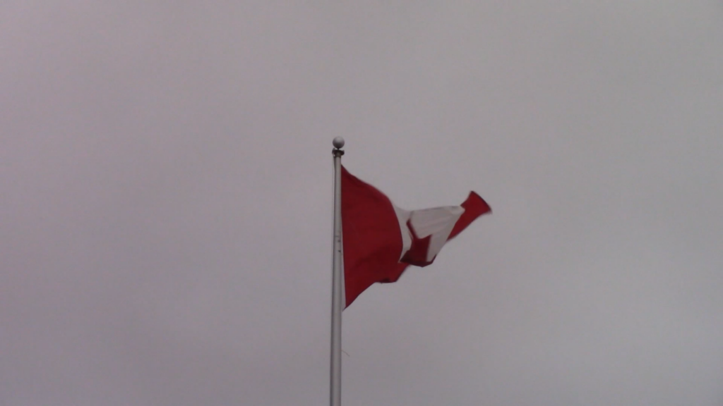
Worm Eye – FS 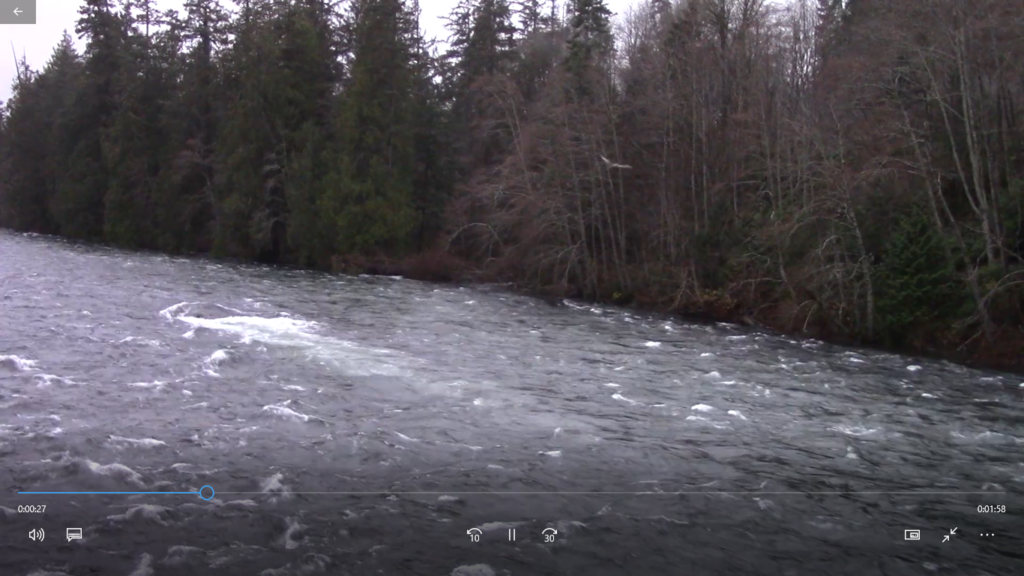
High Level – WS/LS 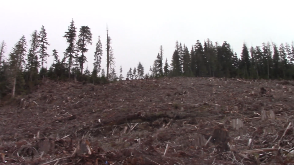
Worm EYE Pann – WS/LS 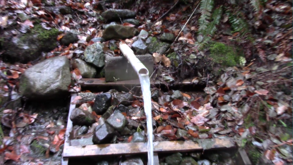
Eye Level Zoom In – MS to ECU 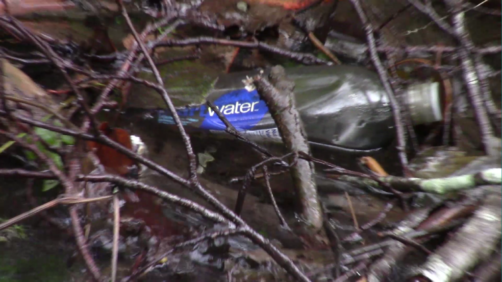
High Level Zoom Out – CU to FS/WS/LS 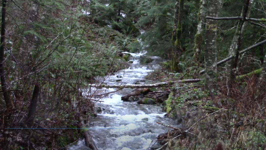
Eye Level – MS/LS 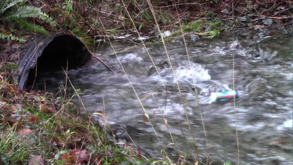
High Level – MCU 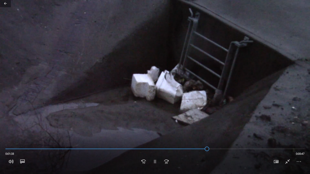
High Level Zoom Out – CU to FS/MS 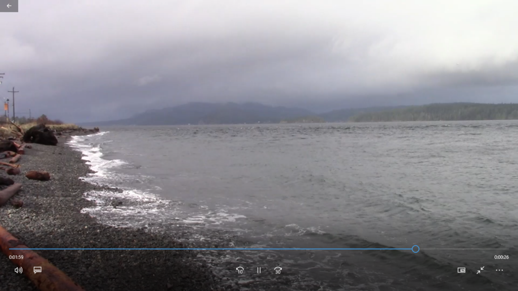
Eye Level – ELS/WS 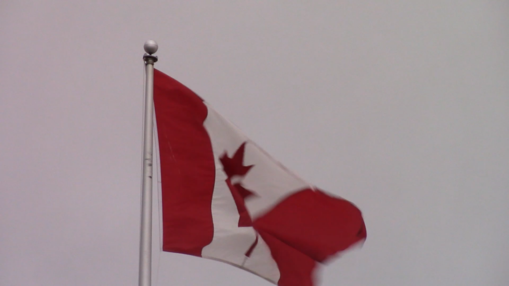
Worm Eye – FMS 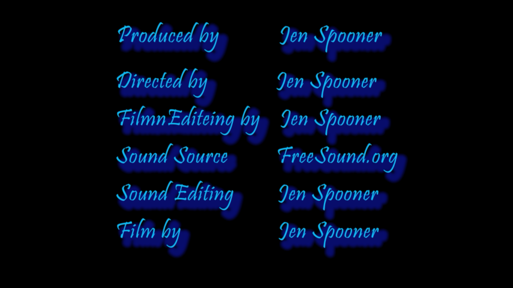
Credits
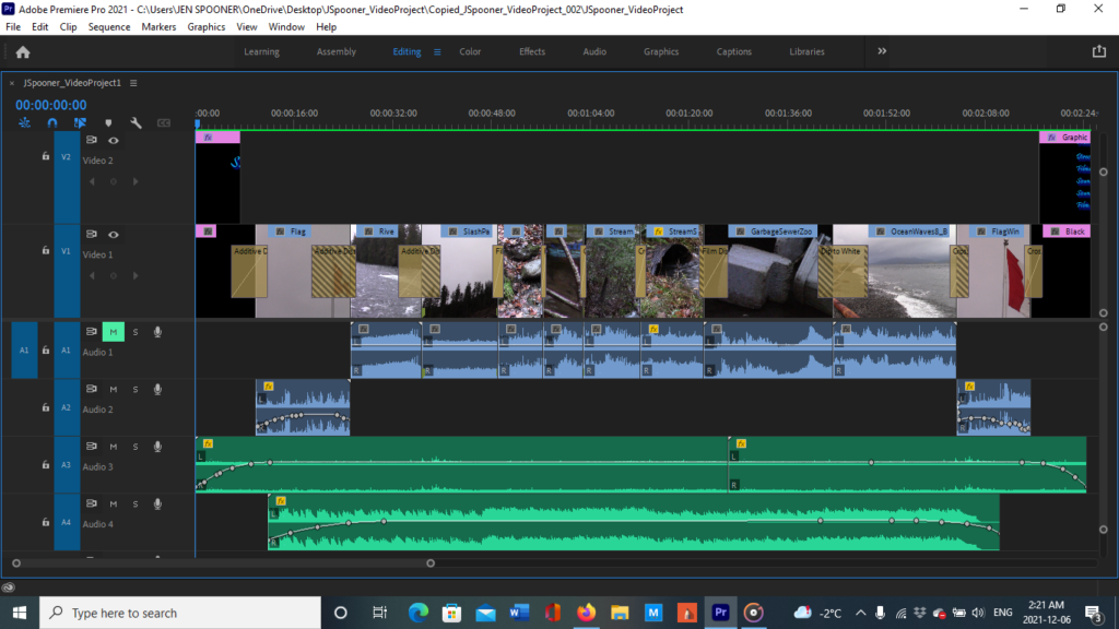
Video Project Proposal 1 & 2
Thumbnail templates -Pencil Drawings
Video Project Proposal #1 :Destruction, A Natural Movement
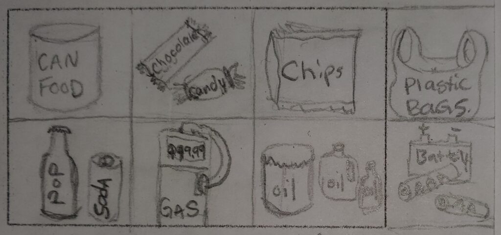
#1 Consumer Products and Garbage – 8 x 1 Second Still Clips (MC)(CU), Eye View
after song in back ground of the video still clips.
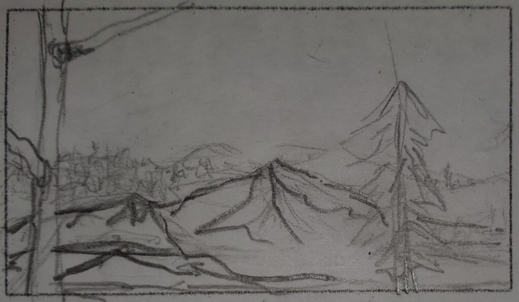
#2 Mountain Tops – (EWS)(ELS) Aerial View 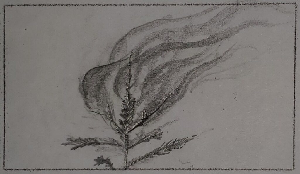
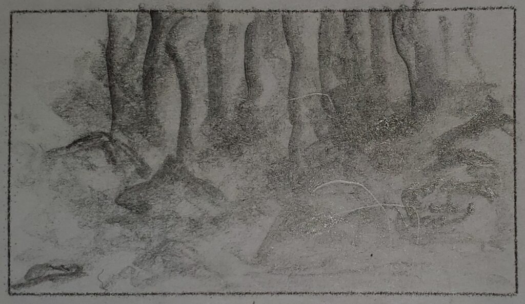
#3 Treetop Burns – (MS)Low Angle View, zoom In Flame
CLIP #3 – Top of a tree is burning, camera zooms into the flame. Crackling sounds of a fire in background. *
#4 Base of Waterfall – (MWS) Eye View, zoom out 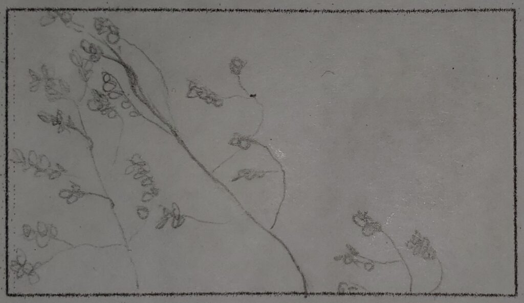
#5 Tree Tops Moving In Wind – (MS) Low Angle View
CLIP #5 – low angle view of the tree tops moving in the wind. sounds of howls and winds whistles in background.
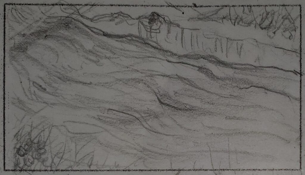
#6 Side View Flowing River – (MWS) Dutch angle View 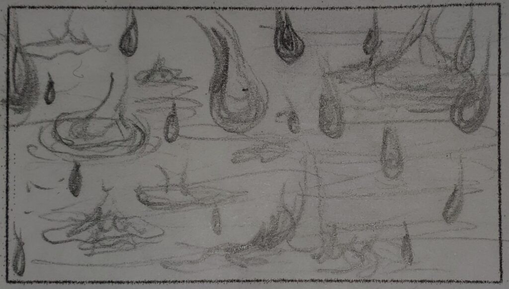
#7 Heavy Rain splattering on the ground – (CU) Slight High View / Eye View
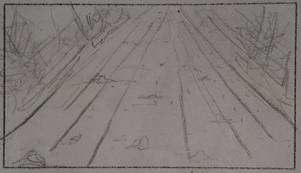
#8 Road Moves Backwards – (WS)(LS)Slight High Angle 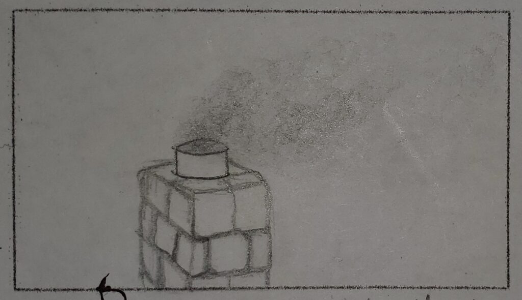
#9 Smoke Stack – (MWS) Eye View
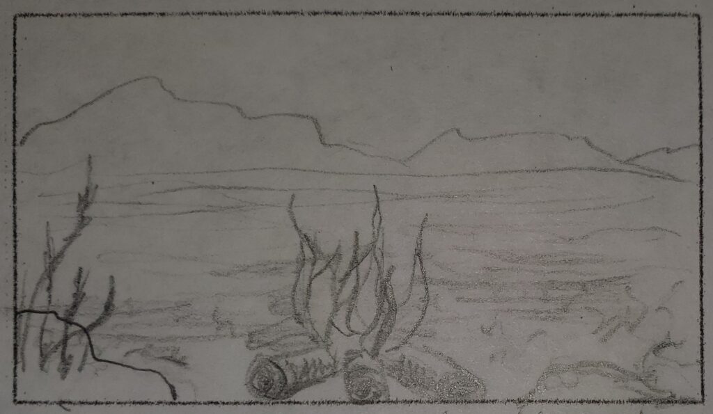
#10 The Four Elements; Earth, Fire, Water, Air (FS) (EWS) (ELS)
will be in the composition of this shot.
Video Project Proposal # 2 – A Piece of Mind
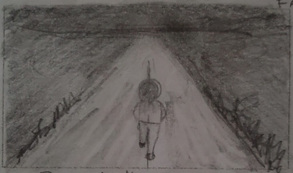
#1 Person Walking into the Darkness – (LS) (WS) Eye View 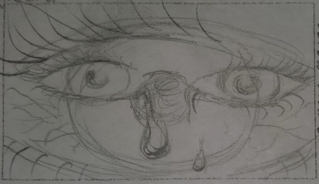
#2 Eyes to Eye – (CU) to (ECU) Eye View, Zoom In
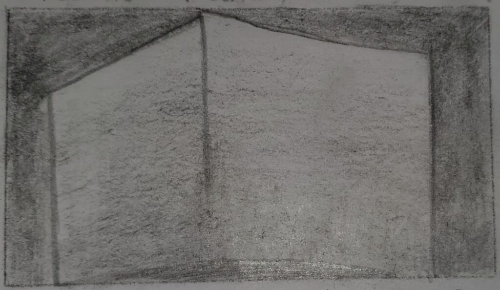
#3 A Box Shaking – (MCU) Cowboy View 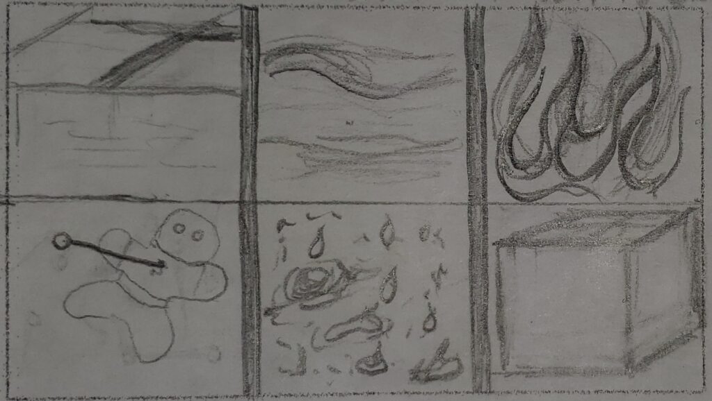
#4 Six Stills of Emotions – (CU) (ECU) Eye View
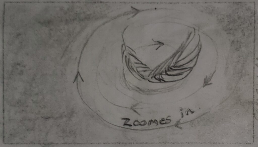
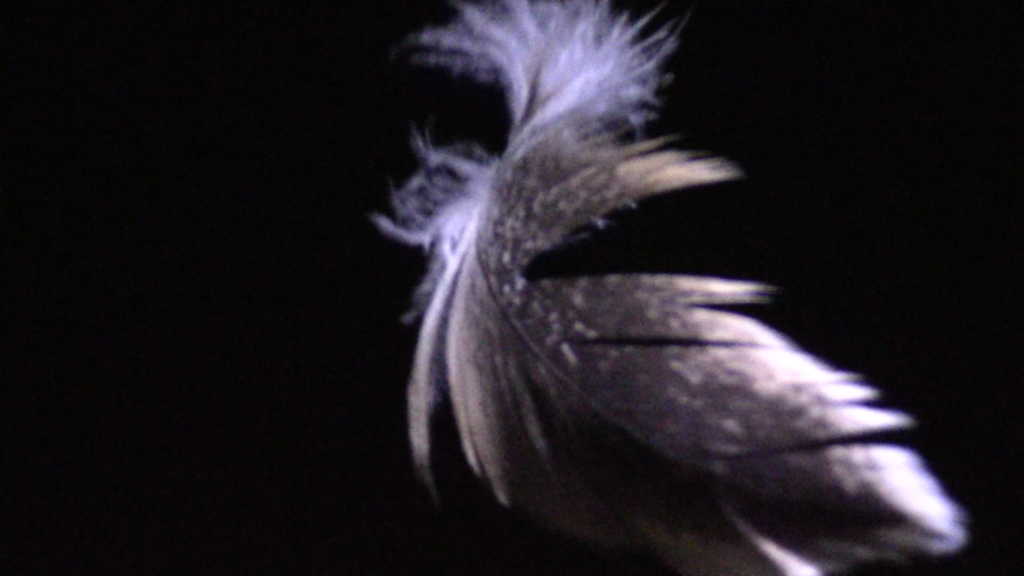
#5 Feather Spinning In Darkness – (FS) to (ECU) Low Angle View, Zoom In. 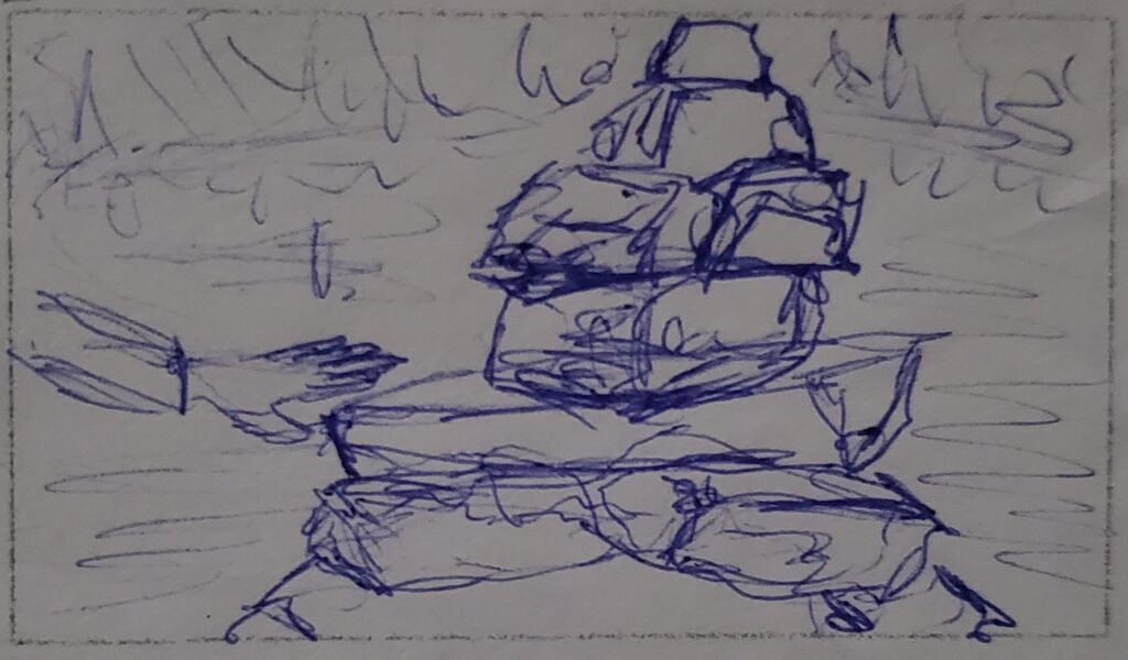
#6 Building with Rocks – (MCU) (WS) Cowboy View
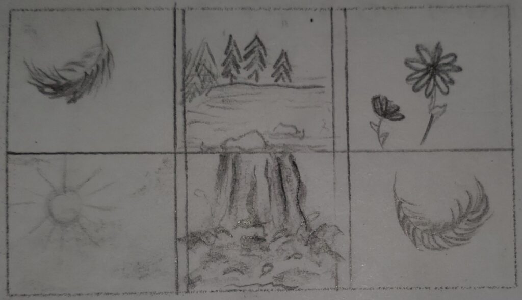
#7 Six Stills of Emotions Light (FS) (LS) (WS) (MS) Eye View / Low Angle View 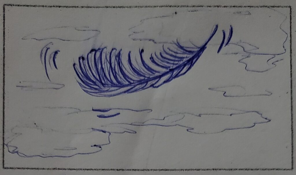
#8 Feather Floating in the Sky (FS) (WS) Low Angle View
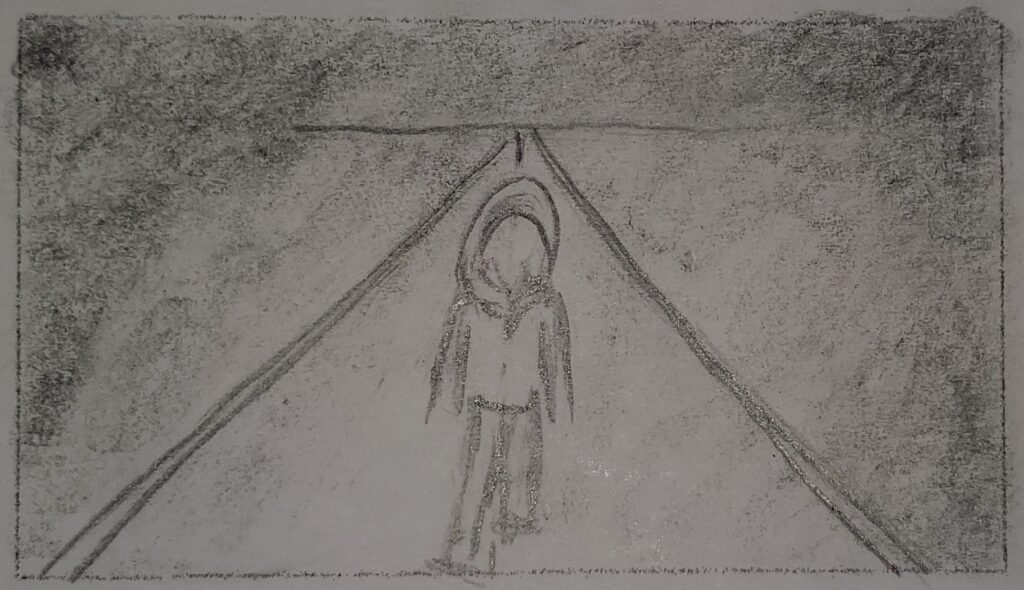
#9 Person Walking Away From the Darkness (LS) (FS) to (ECU) Eye View
MOVIE REVIEWS
Title Sequence Review: True Blood
The Fits : A Review
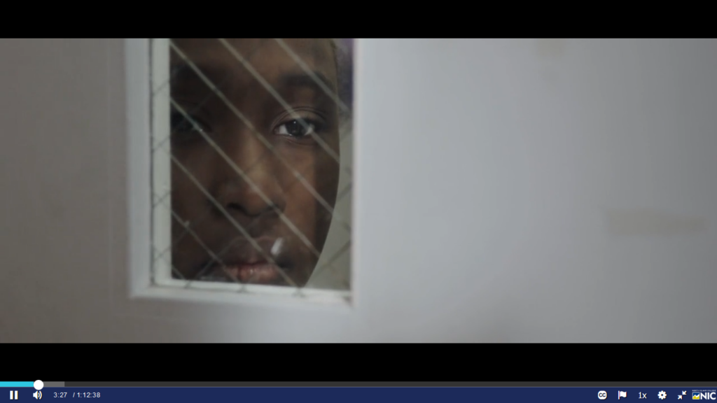
The central Themes of the film are of Boxing and Dance and a young girl who engages in both. The main charter, a young girl named Tony, stood out to me the most, I felt a connection to her. She was constantly alone in her own thoughts watching everything around her from the out side, she had passion and ambition she is a Boxer, but when she saw the dancers at the beginning of the movie she knew that is what she really wanted to do, and she practiced until she learnt that dance. The color throughout the film were dull and neutral cool earthy tones, but when Tony and the dancers were in the gym for dance the colors brightened up with more colorful clothing and costumes. the color pallet of scenes of the Boxing gym were blues and reds and whites. The shots throughout the film were quite intimate, with lots of close ups (CU)of the main character Tony. most of which had the background burned so the focus was on Tony. Overall I liked the film but could not really understand the sickness the dancers were getting and what it meant.
Lecture and Quiz : Video As Art
Installation Art is set up in a space where people can go physically view the art in person. It is a form of art the keeps the viewer interactive with the art piece. Whether the viewer is listening to a sound piece and watching a series of videos shot put together to form beautiful video soundscape . Or installation art can be interactive or it can be viewed as sculpture, paintings or drawings. The ideas and concepts for installation art is unlimited.
VIDEO + Sound Basic Editing
TECH Exercise: Titles
In this TECH exercise I learnt how to add black space at the beginning and end of the video sequence. I then learnt how to add names and titles with in the video sequence and the black spaces.
TECH Exercise: Sound Edit, Premiere Pro
In this sound edit TECH exercise I learnt how edit the sounds in each clip, as well as copying ambiance sound from a video clip and adding it to a different part in the video sequence.
TECH Exercise: VIDEO Color and Blends
In this Tech exercise, I first learnt how to upload media in what is called a project folder, that is where all the files you are working with are stored. I then learnt how to match skin tones of the different video clip in the sequence. There is a Lumetri Color Correction option, where you can adjust the saturation and black and white values, adjust the of level of Reds, greens, and blues in each video clip. You can adjust the shadows, mid tones and highlights. I also learnt that instead of adding an effect on top of each clip you can add an adjustment layer, and the effect is with in all clips in the video sequence. there are lots of different ways to blend the video clips together, too many to list, but it was fun to play around with.
TECH Exercize: Introduction to Premiere Pro
In this Tech exercise I learnt how to upload and do a few quick edits using video clips provided by my class instructor. I uploaded the video clips on a timeline in a video editing software called Premiere Pro. In Premiere Pro I learnt how to add, delete and fade sound from a video clip, get rid of black space within the video clip, delete a hole clip in the time line, resize different clips to all match the same picture size, I also learnt how to slow down, speed up and reverses a video clip and add transitions so each clip looks smooth and nice when changing to another video clip, as well as adding black or white or a color to the beginning and end of the video timeline.
https://youtu.be/VsPWbf6dPww – link to my copy of the Tech Exercise
Exploring Camera Shots + Angles
TECH Exercise: FRAMING SHOT SIZE + ANGLES
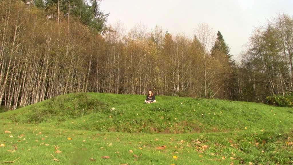
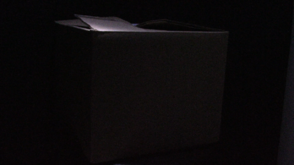
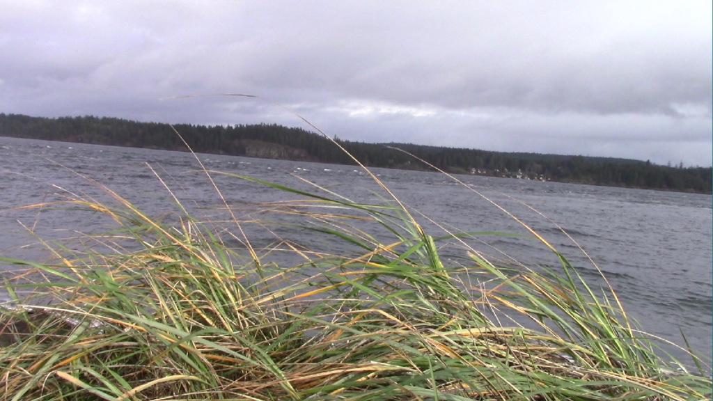
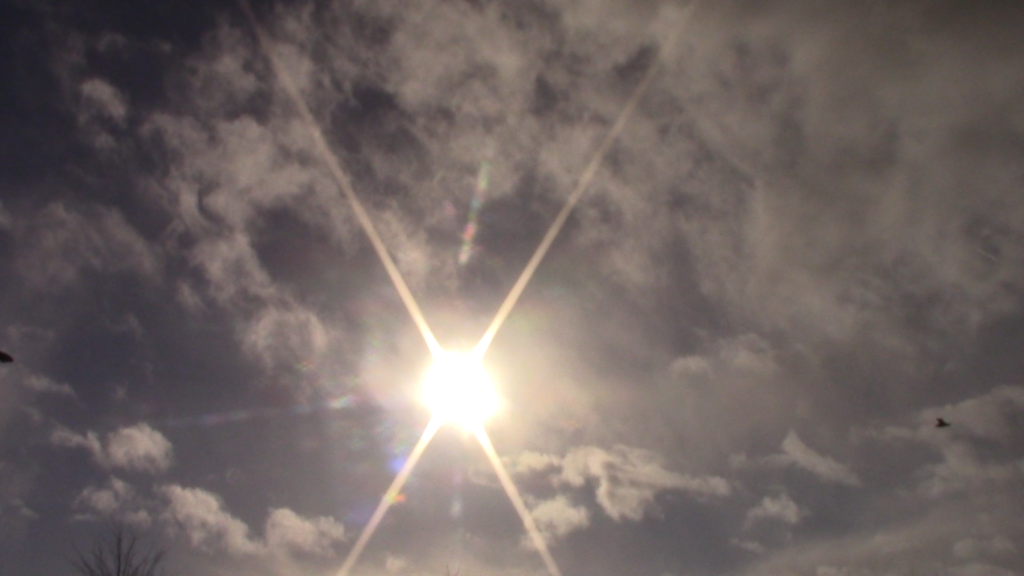
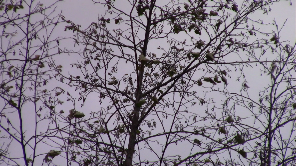
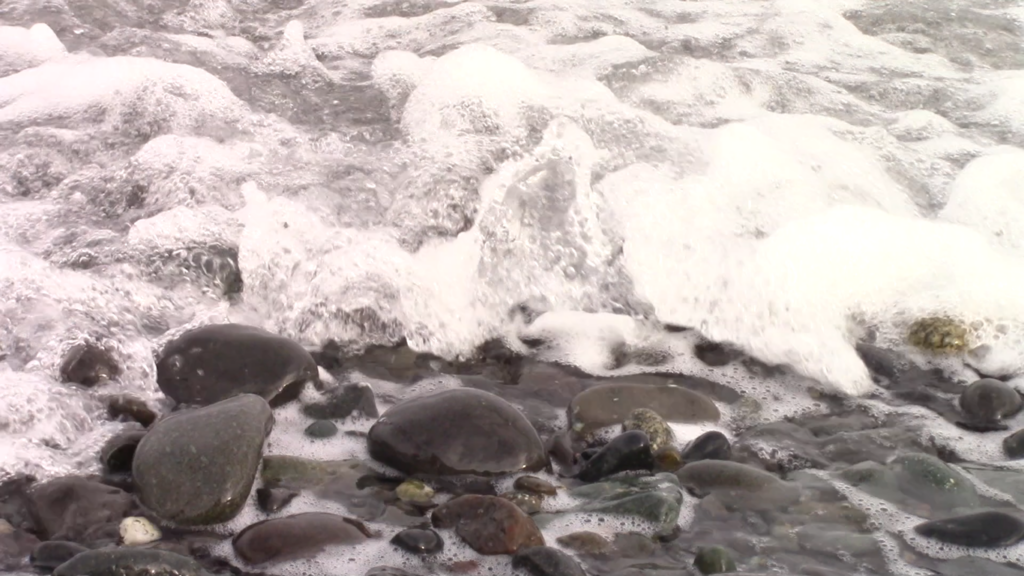
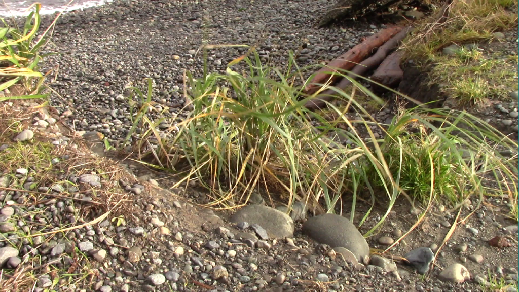
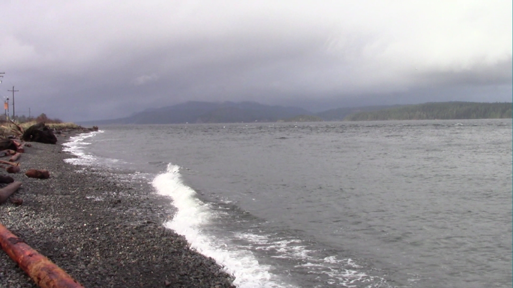
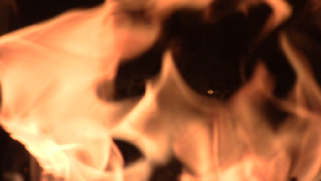
FORMAL ELEMENTS IMAGE SEQUENCE + ANALYSIS
Image Sequence 1 – A Day of Riding
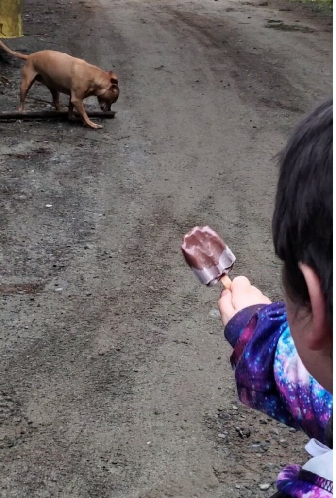
Eye Level – Macro CU/LS 
Eye Level – ECU 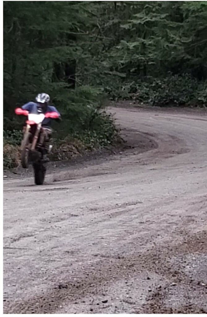
Eye Level – WS/LS 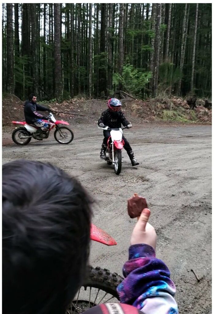
Eye Level – CU/WS/LS 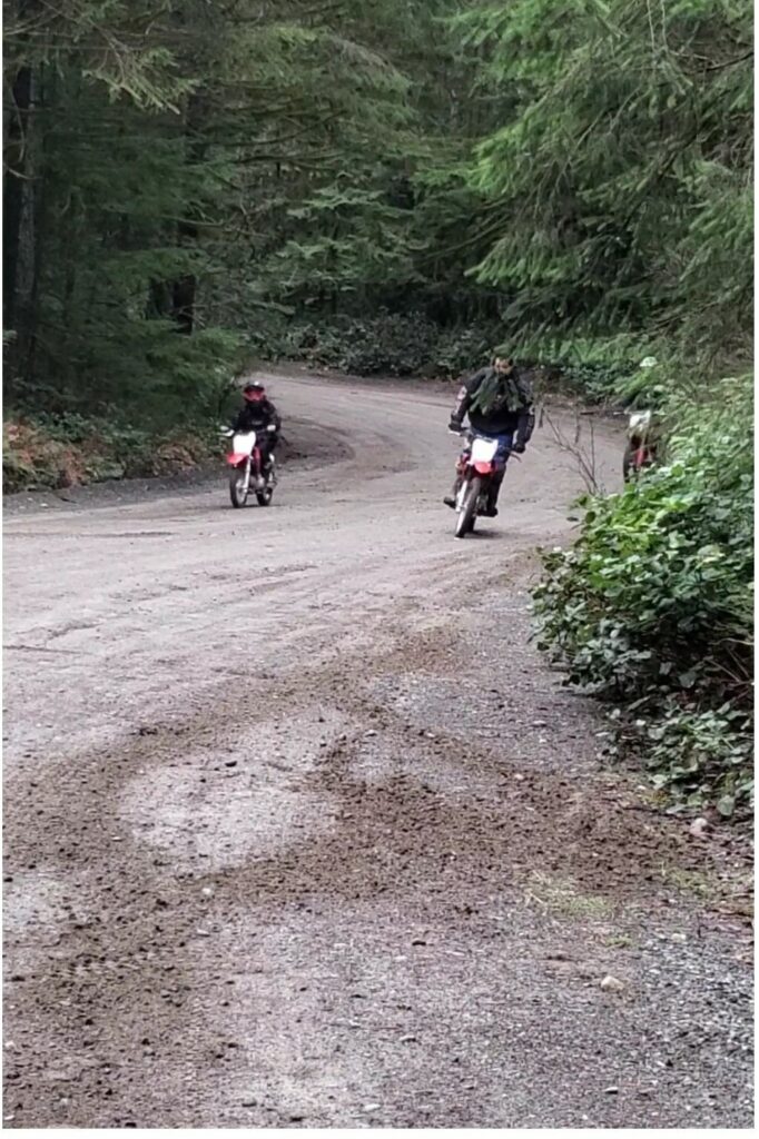
Eye Level – WS/ELS 
Eye Level – FS
Formal Elements Analysis (Sequence 1)
Color Palette : The colors throughout the image sequence are rich in greens, browns and skin tones. which sets a earthy, outdoors mood. The warm earth tones with the accenting reds, blues and purple colors gives a feeling of warmth, joy, love and excitement .
Scale + Perspective: The perspective throughout the image sequence is at eye view, but the view in the first image in the sequence is slightly tilted down. the scale changes within the sequence. The first image is a medium shot showing the viewer depth of field. The second image is quite different as it is an extreme close up putting the focus on the eyes of a person. The scale changes throughout the sequence giving your eyes a different composition in every image in the sequence.
Negative Space: Image one, three and five in the sequence the negative space fills the composition. The empty space on the gravel road gives you a feeling of freedom and not knowing what is to appear.
Depth: There is a push and pull within the sequence with long shots, close ups and medium shot. The images push your view back to see the depth of field, then pull your view in putting the focus of the figures and objects in the landscape.
Image Sequence 2 – Rest Stop
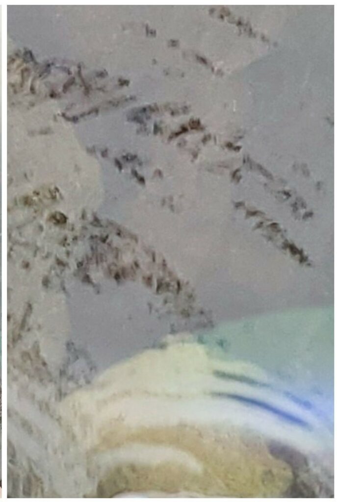
Overhead – ECU 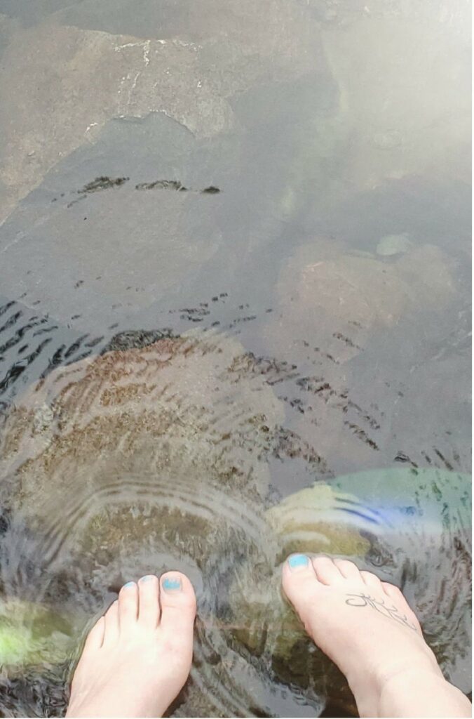
Overhead – CU 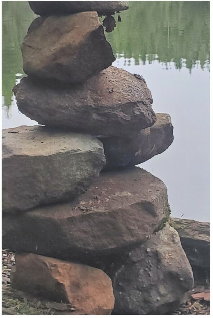
Eye Level – CU 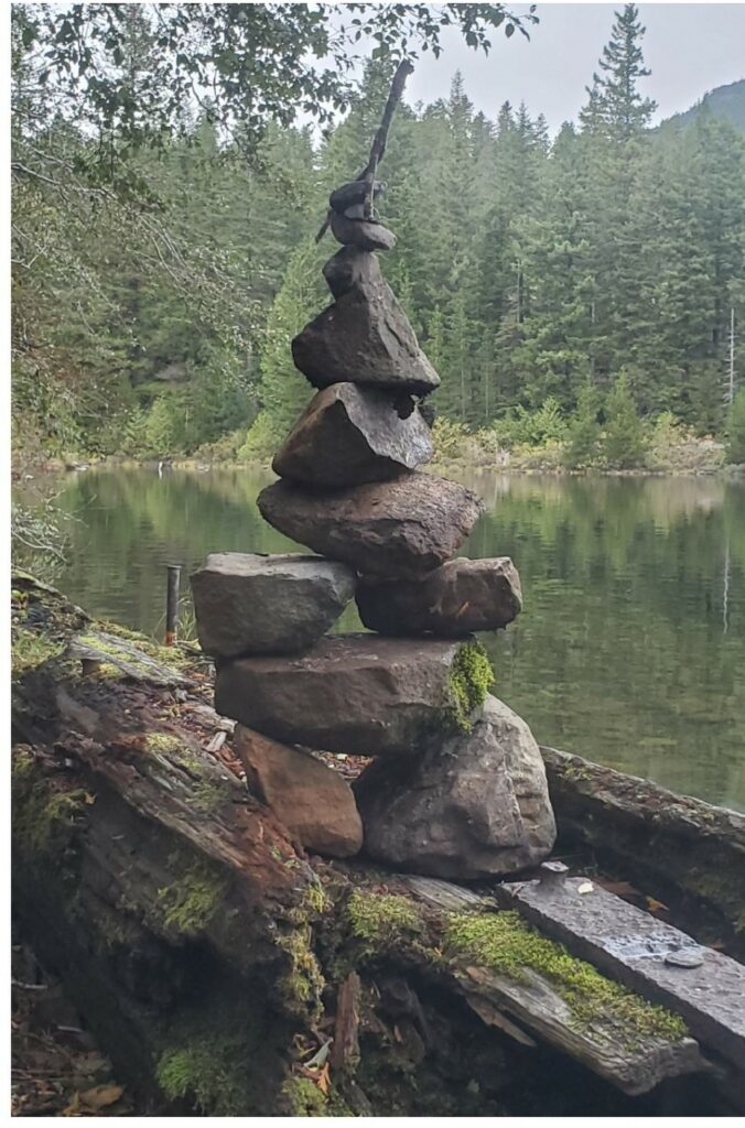
Eye Level – FS 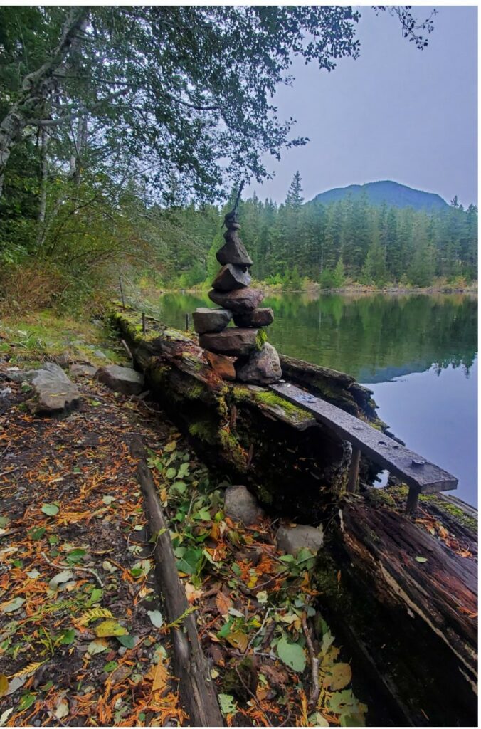
Eye Level – WS/LS 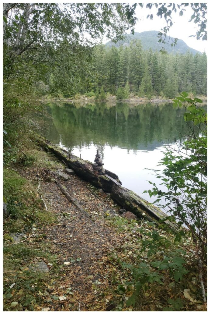
High Angle – WS/ELS 
Macro/Cu
Formal Elements Analysis (Sequence 2)
Color Palette: The vibrant oranges within the earthy tones of greens, browns and blues in the last three images brightens the moods of the images and portrays and happy feeling. where as the images one through four have cool tones, blues, greens, greys and browns. The cool gives a feeling of stillness, or loneliness. at the start of the image sequence the mood is cold, quiet, as you move through the sequence the colors change and get brighter which ends the sequence in a bright happy mood.
Scale + Perspective: The perspective start off as an overhead shot in the first two images in the sequence. the in moves to eye view for image three, four and five. In the last two images, six and seven the perspective shifts to a high angle view then a slightly tilted down view. The perspective moves your view to, looking down, to looking straight, to looking down again. The scale go from close up to far way to close up again.
Negative Space: Negative space fills the composition in the first two images in the sequence which gives a feeling of emptiness. Then the rest of the images have little or no negative space and the feeling of richness and fullness is portrayed.
Depth: At the start of the sequence your view is close pulling you in and the sequence progresses you get a sense of depth. The composition has landscape and more colors. As the composition ends, the depth of field disappears again.
